The Constructivist Mars


For this final project, I was tasked with the challenge of creating a brochure for a newly colonized settlement on Mars! This brochure must be created in the “voice” of a major Modernist art movement. I chose Constructivism and the artist I decided to emulate was Aleksandr Rodchenko, who was hailed as one of the core artists of the Constructivist movement.

But first some info on Constructivism…

“All is a fiction . . . only life and its laws are authentic and in life only the active is beautiful and wise and strong and right, for life does not know beauty as an aesthetic measure . . . efficacious existence is the highest beauty.”(1)

Constructivism was a time of artistic philosophy, reformation, and experimentation that began in 1913 by an artist named Vladimir Tatlin who rejected the idea of organic emotional art and instead began experiment with “constructing” art. He was heavily influenced by Cubism and turned those ideals toward the idea of creating art through modern industrial materials. (2) After the Bolshevik Revolution in 1917, Constructivism gained momentum using art as a method of unifying and galvanizing the masses. (3) Art became a tool of the proletariat, emotion being traded out for abject meaning and utility. One of Constructivism’s main points being the destruction of all preconcieved notions of “art” and its purpose. Constructivists, such as Aleksandr Rodchenko, wished to integrate art into everyday life, believing that art is no longer made for the sake of art but instead created for social function. They considered themselves engineers in artistic experimentation instead of emotional artists and believed that art could be manufactured just as rationally as any other product. Everyone is considered equal and the artist is merely a worker just like all others of the working class. (4)


The work I will formally break down for you is Aleksandr Rodchenko’s Soviet political poster, “Books (Please)! In all Branches of Knowledge”.


           Aleksandr Rodchenko, “Books (Please)! In All Branches of Knowledge”, 1924, Letterpress.


This work is an exercise in boldness. The subject is political in nature and dominates the content of the work, being the central focus of its purpose. Color, shape, and line are all thick, heavily saturated, and perfectly formed. All are meant to draw attention to the work and its message. The only moments of delicate detail and subtlety of value being in the composited photograph of the woman within the circle. She has been shot from a dynamic angle with a happy, excited look on her face adds to the energy of the work and establish a positive mood for the content.

The colors of the work are kept to a limited pallet of highly saturated red, black, grey, and white (although time has weathered the white of the paper to a light tan but it still works well). These colors are used to define areas of focus as well as lead the eye throughout the work.


All the shapes and lines of the work are sharp and defined. The Lines are created by negative space between the shapes and add extra dimension to the design. They become outlines that serve to emphasize those heavy geometric shapes while at the same time collecting them into larger areas of shape within the space. This assists in allowing the eye to travel smoothly from one side of the image to the other without being overwhelmed by all the collective parts or caught on the bold text.


The eye starts first at the circle on the left. This is due to the fact that the human eye is naturally drawn to circular shapes and images of faces. This is further assisted by the fact that the gradient of the image in the circle is so different than the rest of the work. The eye moves to the right, funneled by the large triangular section of geometry that comprises the right half of the work. It is from there that the eye follows the dark outer shapes of black that extend from the end of the triangular section and is bounced back to the left side of the work where it then circulates back into the image of the woman. The movement in this work is extremely important. With forms that are made up of many simple bold shapes and colors, it is all too easy for the eye to be completely overwhelmed and completely miss the text and the overall message of the work. This is why having a clear focal starting point and well defined leading lines are so important to this piece. It has to be both dynamic and legible, of which this work has achieved expertly.


                                Brittany Katz, “The Constructivist Colony, Cover”, 2018, Photoshop 


                                                                          Brittany Katz, “The Constructivist Colony, Inside”, 2018, Photoshop


Comparison


                                   Aleksandr Rodchenko, “Books (Please)! In All Branches of Knowledge”, 1924, Letterpress.

                                                      Brittany Katz, “The Constructivist Colony, Cover”, 2018, Photoshop

For my project, I studied, “The Realistic Manifesto” by Naum Gabo and Antoine Pevsner. I took inspiration from three of Rodchenko’s works, taking their base patterns and shapes to create a three paneled brochure where each piece could function both as a singular image and then as a cohesive whole. Constructivism at its core, is extremely geometric and relies on extreme organization and logic in its art. Images are meant to be universally recognized and interpreted without effort. Everything has a purpose and is meant to support the meaning of the whole.


                                  Aleksandr Rodchenko, “Novyi LEF”, Zhurnal levogo fronta iskusstv, 8, 1928, Letterpress.


                                 Aleksandr Rodchenko, “Books (Please)! In All Branches of Knowledge”, 1924, Letterpress.


                                                  Aleksandr Rodchenko, “Rechevik”, Stikhi (Orator. Verse), 1929, Letterpress.


I took advantage of the way smaller geometric features are grouped together to create larger shapes as a means to connect my three pieces together. I used negative space, edges of shapes, and angled lines to create a central triangular shape at the bottom of the brochure that leads the eye up to the image of mars and the surrounding depiction of the Utopian society.


                                                              Brittany Katz, “The Constructivist Colony, Cover”, 2018, Photoshop

The trajectory of the rockets as well as the angle of the text on the right panel mirror each other and serve to support the central focus of Mars in the center. The designs of the rockets are based off of the actual rocket prototypes that were being developed by Robert Goddard during the early 1920s. (5) Of course one major issue with this was that they looked more like missiles than modes of transportation so I had to add some minor fins and small windows to make them less threatening.

                                                                              Robert Goddard with Rocket Prototype, 1926


 Artist Unknown, Russian Propaganda Poster                               Aleksandr Rodchenko, “Ensemble”, 1922, created 2005

My Figure of Figures is used as the starting focal point of the brochure, the inspiration for his style being the iconic propaganda picture of Russian workers building the future. However, figure is wearing a jumpsuit that was designed by Rodchenko himself as a concept of future Russian fashion. Unfortunately, Rodchenko never got to see the completed jumpsuit before he died in 1956. (6)


Rodchenko often included the use of composited photographs in his designs. He was an avid photographer and often abstracted his pictures by shooting from an extreme angle where the subject is obscured in favor of emphasizing shape and form. (7) I used the same principal and shot various everyday objects from such unusual angles that they were no longer identifiable as their original subjects. I then composited parts of these photographs together to create the Colony city scape.


                                                     Brittany Katz, “The Constructivist Colony, Inside”, 2018, Photoshop

I decided to go with the positive, self-empowered aspects of Constructivism for the purpose of attracting people to live in the Colony. I used text for the brochure that illustrated a sense of empowerment, taking your fate into your own hands and rising to a better existence. From what I have read, Constructivists like to focus on the here and now, going so far as to say that the past and future no longer matter. This posed a bit of a problem seeing as brochures by their very nature deal with enticing people with possible subjects for their future. However, when I really deconstructed all the poetic wording in the manuscripts, I realized that Constructivists aren’t ignoring the future completely. They just recognize that no one can predict the future, so it’s useless to waste time worrying about. They hold the belief that one should put their utmost effort in actively participating in their present. By doing so, they will not need to think about the future because it will subsequently be built upon the best efforts and values that are actually real to the individual. No need to look ahead or worry about the future because you are already giving best efforts in living your life. So I went with the theme of “you should move here now because you are better than Earth and this place matches who you are”.


  1. Caws, Mary Ann. Manifesto: A Century of Isms. Lincoln: Univ. of Nebraska Press, 2001. Accessed December 11, 2018. https://books.google.com/books?id=lKONAETXi-kC&pg=PA400&lpg=PA400&dq=the past we are leaving behind as carrion the future we leave to the fortune teller&source=bl&ots=5CnlxVO5-j&sig=upj7ne4XAeIFAxaT6WK8XJnSPR8&hl=en&sa=X&ved=2ahUKEwiinqST8JrfAhVrs1QKHYvyAksQ6AEwAHoECAoQAQ#v=onepage&q=the past we are leaving behind as carrion the future we leave to the fortune teller&f=false. Pages, 398-400


  1. Blumberg, Naomi, and Gloria Lotha. “Constructivism.” Encyclopædia Britannica. July 28, 2015. Accessed December 11, 2018. https://www.britannica.com/art/Constructivism-art.


  1. “Agitation and Propaganda: The Soviet Political Poster 1918–1929.” Frye Art Museum. Accessed December 10, 2018. https://fryemuseum.org/exhibition/6262/.


  1. Elder, R. Bruce. Harmony and Dissent : Film and Avant-Garde Art Movements in the Early Twentieth Century. Waterloo, ON: Wilfrid Laurier University Press, 2008. Accessed December 10, 2018. ProQuest Ebook Central.


  1. Garner, Rob. “Dr. Robert H. Goddard, American Rocketry Pioneer.” NASA. February 11, 2015. Accessed December 11, 2018. https://www.nasa.gov/centers/goddard/about/history/dr_goddard.html.


  1. “Ensemble | Rodchenko, Aleksandr Mikailovich.” V&A Search the Collections. Accessed December 10, 2018. http://collections.vam.ac.uk/item/O297713/ensemble-rodchenko-aleksandr-mikailovich/.


  1. MoMA. “Aleksandr Rodchenko.” MoMA. Accessed December 09, 2018. https://www.moma.org/artists/4975.


i. Bann, Stephen. The Documents of 20th-Century Art: The Tradition of Constructivism. New York: The Viking Press, 1975.


i. Tate. “Rodchenko and Popova: Defining Constructivism: Explore the Exhibition, Introduction: Introduction.” Tate. Accessed December 09, 2018. https://www.tate.org.uk/whats-on/tate-modern/exhibition/rodchenko-popova/rodchenko-and-popova-defining-constructivism.
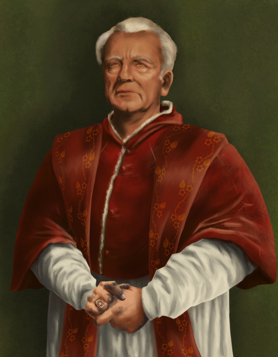
Pope Palpatine the Sidious.

When the Early Renaissance came to be, artists focused less on idealization of forms and instead began to focus on painting with as much realistic detail as possible. This ideology of drawing the minute details as accurately as possible became known as Naturalism, the technique of drawing forms and environments according to how they are seen in nature. Trees looked like trees, rocks looked like rocks and improvements in perspective and proportion meant you even saw someone’s back once in a while. It was all very exciting. Huge strides in artistic technique, with ability and skill being highly prized, lead to the increasing belief that possessing such artistry was a sign of status. This caused a massive increase in commissions of works and portraits from individuals rather than just from the traditional religious organizations. The artistic business boomed with massive artist guilds popping up all over the Western world and new masters gaining notoriety.


Hans_Holbein_the_Younger_-_Thomas_Howard,_3rd_Duke_of_Norfolk_(Royal_Collection).JPG


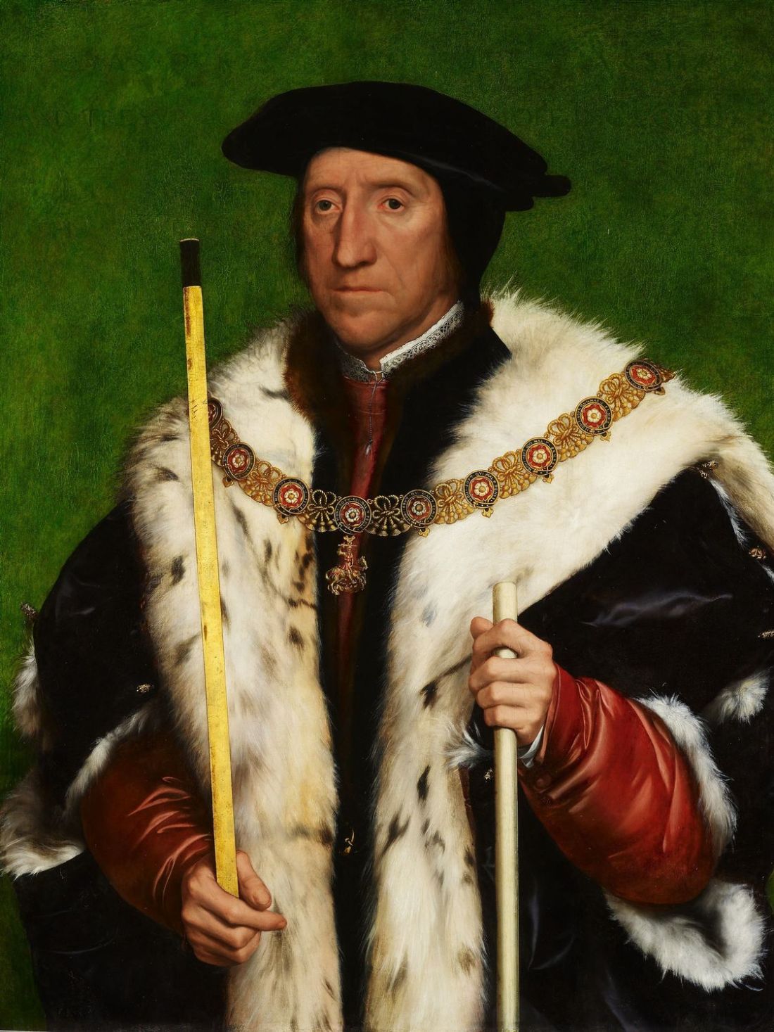
Hans Holbein the Younger, “Thomas Howard, Third Duke of Norfolk”, c.1473 -1554, Oil Tempera on panel, 80.1 x 61.4 cm, Windsor Castle, England.

This Portrait by Hans Holbein the Younger features Thomas Howard, 3rd Duke of Norfolk, created with oil tempera on wood. For a portrait of a single individual, Holbein does an excellent job of dividing the space effectively to create balance and movement.


The triangular shape of the Duke is a dark solid starting focal point that draws the eye from the base of the figure, The lines of the fur mantle funnel the eye up to the central focal point which is the face of the Duke. The eye then continues up to the background at the top of the image, and diverges to lead back down the sides of the painting to the base of the triangle.

The colors of this painting are highly saturated with the only exception being the slight tomato tone of the silk sleeves but that is more likely to be due to the colors used in the highlights.  The intensely saturated expanse of green background serves to balance out the heavy dark tones of the figure. The richness of the colors all point to signs of wealth and nobility. Brightly painted rooms in intense tones used to be seen as a sign of wealth and elegance due to the fact that the pigment was expensive.


texturesrenaissance

The textures of this painting are extremely decadent. The highlights on the different materials and how they are applied is the prime method in which textures are established. The shape of the silk shirt is sharp and defined while the highly contrasted yet fuzzy highlights on the cloak give the distinct soft impression of velvet. The fur is extremely feathered and rough, with individual hairs being easily distinguished while a more slight tonal general highlight is used over the majority of the surface. The skin tones are extremely smooth, with saturated shadows mixed with subtle areas of lighter tone without highlights reaching extremes at any point. The edges of the figure are sharp and well defined, with the only soft blurred edges being used for fur and hair.


renaissancePalpatinelighter2

Brittany Katz, “Pope Palpatine the Sidious”, 2018, Photoshop

For my portrait I was assigned the nefarious Emperor Palpatine also known as the Sith Lord, Darth Sidious. Since Sith Lords were in short supply during the Renaissance, I decided to find an equivalent historical figure in which to base his depiction off of. I decided that Rodrigo Borgia also known as Pope Alexander VI would be the perfect figure him to emulate. Rodrigo Borgia was a powerful religious figure who ruled over a vast culture and came to power through manipulation, subterfuge, and even murder. He is one of the most Infamous religious figures in history. Borgia’s main henchman also happened to be his son, the greatly feared Cesare Borgia whom he was grooming to one day take over in his place.(1) The draws a nice connection to Emperor Palpatine and his highly feared Apprentice, Darth Vader.


255611-1330621313 renaissancePalpatinelighter2 Palpatine4

 Holbein Portrait                             My Pope Palpatine Portrait        Emperor Palpatine (Actor, Ian McDiarmid)

In the style of Hans Holbein the younger, I depicted Emperor Palpatine in typical papal garb, appearing as he did before his disfigurement into an evil-looking wrinkled mess. This first visual decision was made for two reasons. The first is that I wanted Palpatine to look normal in order to best illustrate the underhanded sinister nature he was so well known for. The second is that Rodrigo Borgia was described as a good looking man and since he is the base for the translation I decided to keep in line with that theme.(2) While Palpatine may look normal I added several symbolic meanings to imply the darkness of his nature.


                                               Pope-Face Palpatine                                                           Sith-Face Palpatine

The first is that I decided to give Palpatine the evil Sith eyes that he gained after his disfigurement. This is a play-off of the saying, “the eyes are the windows to the soul”, whereas even though Palpatine looks nice and approachable, you can see the evil within. Emperor Palpatine’s sash also features an ominous symbol, a pattern of Atropa Belladona, also known as Deadly Nightshade. It was a common symbol for evil, death, and poison.


                                  Typical Papal Ring                    Emperor Palpatine’s Ring               Galactic Empire Symbol

Moving down further to perhaps the most poignant area of the portrait is Emperor Palpatine’s hands. On his right hand rests his papal ring but instead of depicting a patron saint, of which a typical pope chooses as their figure to emulate and guide them, Palpatine’s ring depicts the symbol of the evil Galactic Empire. This is a symbol as well as a message that Palpatine worships no other but himself and his Empire.


renaissancePalpatinehands full_arsenic_pic7

                       Emperor Palpatine’s Hands                                                Physical symptom of prolonged Arsenic exposure

Since the force didn’t exist in the renaissance, Palpatine would have most likely used poison as his weapon of choice for eliminating enemies. Looking closely at the hands Emperor Palpatine, you can see that there is discoloration in the nails and fingertips the nails have turned a blackish blue in the hands themselves have discolored with patches of Black soot like blemishes. This is a visual sign of extended exposure to handling Arsenic, a toxic substance that is extremely deadly and was often used in poisons.(3) Arsenic is also the base for the legendary Cantarella poison of which Rodrigo Borgia and his family were famous for. The poison was a tasteless powder that would be sprinkled into the food or drink of the unfortunate victim. Its potency could be altered so that the time it took to kill the victim could be as short as a few minutes or as long as a few days.(4) As a parallel, Emperor Palpatine’s method of choice was to meet out death through the use of force lightning. Those who opposed these men had a nasty habit of turning up dead and the replacements all tended to be loyal supporters. They literally had the power of death at their fingertips without the need of a physical weapon. It is perfect also because the discoloration from Arsenic exposure looks a lot like electrical burns.


aea7ef6925efb4d0ab03722fd7dc4912

Titian, “Portrait of Alessandro Farnese, Pope Paul III”, 1545- 1546, Oil on Canvas, The Hermitage Museum, Italy.

Palpatine’s Garb is that of a typical Papal figure which created a unique issue in designing this piece. Papal figures are typically featured in Italian Renaissance style of art consisting of tons of old religious men in deep red robes in front of a dark void-like background. However, the style I’m trying to emulate is that of Holbein’s Northern Renaissance, which rarely depicted the Papacy. To correct this issue, I decided to make the background a simple color that is more typical of Hans Holbein the Younger rather than Italian artists. However, considering the evil nature of the subject, I toned down the jewel tones that Holbein tended to use in favor of a more subtle forest green tone. That way the style is still in line with Holbein’s style but won’t fight with the red of the Papal robes and will also reflect the dark nature of the subject. Emperor Palpatine is a Master of the Dark Side after all.


  1. Herbermann, Charles George, Edward A. Pace, Condé Bénoist Pallen, Thomas J. Shahan, and John J. Wynne. The Catholic Encyclopedia: An International Work of Reference on the Constitution, Doctrine, Discipline, and History of the Catholic Church. Vol. 1. pg 289-293. New York: Encyclopedia Press, 1913.


  1. Ibid.


  1. Karamanou, Marianna, George Androutsos, A. Wallace Hayes, and Aristides Tsatsakis. “Toxicology in the Borgias Period: The Mystery of Cantarella Poison.” Toxicology Research and Application2 (2018): 239784731877112. doi:10.1177/2397847318771126.


  1. Ibid.

Medieval Ghibli

Medieval art spans a massive period of over 1000 years from the 4th to the 15th century. This period encompasses an extremely wide variety of art styles from Anglo-Saxon to Romanesque to Gothic and beyond. One major form of art of this time came in the form of illuminated manuscripts. Originally created for churches to spread the ideas of the Christian religion, these books featured illustrated scenes of religious events or stories.(1)

La-ballena-Bestiario-Ashmole-Oxford

The Whale, MS. Ashmole Bestiary 1511, Folio 86v, c. 1200, Bodleian Library,

This is a page in the manuscript, Ashmole Bestiary 1511 Folio 86v, features a frame scene in middle of a page with text above and below. The scene is framed by a border of stripes and dashes. Within the Border depicts three men in a boat with a single red sail upon the sea. The boat is facing to the right with a man in yellow robes sitting at the stern of the boat on the left, steering. In the middle of the boat facing the stern with his head turned to the right, is a man dressed in blue robes tending to the sail. On the bow of the boat on the right stands a man in orange robes, facing right with head turned back toward the other two men, alerting them to the beast. Below them the ocean rises in a wave using waving lines to depict a swell of water. The image is dominated by a whale colored in dark blue and white lines, swimming in the water beneath the boat. It is facing left as it eats two large fish. There is very little in the way of perspective, the figures and seen are flat with everything taking place in the foreground of the image with only slight overlapping of forms. The environment is limited to a sky of simple black while the ocean consists of a single Mound of blue with waving, patterned lines. The pattern of the water is mirrored in the lines used to color the whale, and in the general weaving pattern in which its many fins are positioned. The colors have faded but it is safe to say that the page was once vibrant in saturated shades of Red orange and blue. All figures in the work feature a dark outline. White highlights and lines are used to create the folds of the fabrics and the edges of the fins with darker tinting of the tones being used to create the illusion of Shadows. Views of the red of the sale successfully draws the eye first to the boat then to the men within the boat and then down to the giant darker form of the whale below.


MedievalSpiritedAway

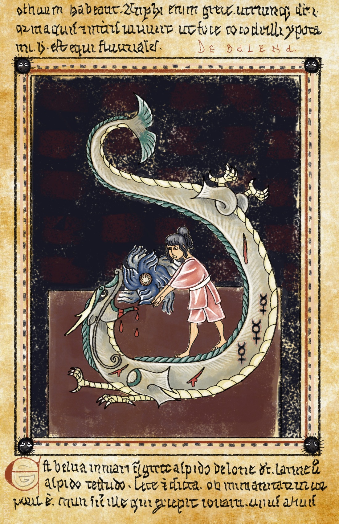
Medieval Sprited Away, Author.

The scene I chose for my page was from Studio Ghibli’s, Spirited Away, specifically the scene where Chihiro saves Haku after he has been attacked and poisoned for stealing a magical cursed seal. She cures him by force-feeding him a gift she received from a powerful River Spirit earlier in the movie. My page depicts Haku and Chihiro in the dark of the boiler room. Haku is writhing on the floor, mouth open and bleeding from many wounds, facing Chihiro. His body twists in pain from the bottom of the page to the top in a vague s-curve pattern. Atop his back stands Chihiro, dressed in her pink work robes. In her hands she holds the orb shaped medicine of the River Spirit as wave style energy radiates from it while in the borders of the page the soot sprites look on with fear and anxiety. For this scene I faced an unusual problem of translating a Japanese style of artwork and stylized subject matter Into an English medieval style of artwork. Chihiro’s outfit and design luckily was easily translatable but Haku in particular posed a larger problem. Dragons in the Japanese style are long and serpent-like, while in medieval English style dragons tend to be more of a bird or bat winged lizard. So in order to solve this problem I decided to add aspects of a medieval sea monster into Haku’s design. To do this, I Incorporated fins into his body owing to the fact that Haku is a water dragon and medieval people most likely would have seen him as a sea serpent or giant monster fish. To show that Haku has been poisoned I put Mercury symbols along his belly with red outlines making it appear as if he has been branded. Medieval artwork in manuscripts tended to be more literal with their symbolism, preferring to directly depict the scene using text for explanation. This is why I chose to make the Mercury symbols physical wounds. I chose the Mercury symbol because during medieval medical practices Mercury was often thought to have healing powers and was even believed to help Grant immortality. The unfortunate reality was that mercury is incredibly toxic and would more often than not kill the patient rather than save them. This ties in nicely to the fact that Haku had tried to steal the seal in order to gain a bargaining chip for his freedom but instead was being poisoned by it. The reason I chose brands rather than showing the medical procedure itself is because during that time period, mercury was taken rectally by means of a long necked jug.(2) I opted against illustrating this rather graphic procedure, deciding that symbolic brands are more than sufficient and that poor Haku doesn’t need to suffer such an indignity. The background I decided to keep Simple. This is because while the room in the movie was highly detailed, it was very dark and environments in medieval art tended to be glossed over in favor of the characters.


  1. “Medieval Art and Architecture.” Oxford Art. Accessed November 11, 2018. http://www.oxfordartonline.com/page/medieval-art-and-architecture.


  1. Andrews, Evan. “7 Unusual Ancient Medical Techniques.” History.com. Accessed November 11, 2018. https://www.history.com/news/7-unusual-ancient-medical-techniques.


  1. i. “Illuminated Manuscripts.” Medieval Squires. Accessed November 11, 2018. http://www.medieval-life-and-times.info/medieval-art/illuminated-manuscripts.htm.

Byzantine Heroes

The Byzantine Empire was a period of time that spanned from the fourth century to the fifteenth century. A massive religious shift swept through the Western world as Emperor Constantine adopted Christianity and moved his empire from Rome to Constantinople in 330 AD in what is now modern day Istanbul, Turkey. While originally favoring the Roman style of artwork, Byzantine art began to shift in order to promote the message of Christianity. Art styles began to diverge from the traditional Roman qualities and instead favored a heavy, flat style that would almost forgo the use of space and perspective entirely. The artwork was usually featured in churches as mosaics and icon paintings and was generally used to depict messages of Heaven and faith. However, during the middle Byzantine period (ninth century to thirteenth century) an event known as the Iconoclastic Controversy occurred where the use of religious imagery was considered blasphemous and anger God. This resulted in the widespread destruction of many important early Byzantine pieces and most of the remaining Roman works as well. Luckily when this period ended, the creation of religious art regained popularity and the last few hundred years of the period experienced a massive increase in artistic production.

862369ea7267ee89657535e7399fa8a9Theotokos of Vladimir. Tempera on wood. Hall Museum Church of St Nicholas, Moscow. 12th Century A.D.

The Image I chose as my base for this assignment is the Theotokos of Vladimir. It is a Tempera painting on wood panel that depicts the Virgin Mary and her child. It was said that work was originally painted in Constantinople in the early twelfth century.  It was originally a gift to Grand Duke Yuri Vladimirovich Dolgoruky and was kept in a convent in Kiev until it was finally transported to the city of Vladimir. According to legend, the horse carrying the painting refused to move beyond Vladimir and the people took it as a sign that the spirit of the Virgin wished to remain in the city. It was placed in the cathedral in Vladimir and was said to have been the spiritual protector of the city.

The Virgin and her son command the central space of the works. In the back, although worn by time and fairly damaged, is a background of gold leaf. This is referred to as the “golden no-space” that was a popular technique for backgrounds during the time. The Virgin is gently holding her child with her right arm as they nuzzle their faces together. The Virgin is dressed in dark blue robes with golden lining and an eight pointed star on her forehead and left shoulder as she stares poignantly at the viewer with somber eyes. The Child is dressed in a red robe with golden highlights, gazing at his mother as he wraps his left hand behind his mother’s neck while his right hand holds on to her cloak. The lines used to create the folds of the Child’s cloak are bold extremely linear, giving an almost metallic feel to the fabric. This stylized geometric treatment of cloth was often used during this time and contributed to the flattened look of Byzantine art. Both the Virgin and her Child also feature the typical facial styles of the age with large almond shaped eyes and a tiny nose and mouth. Despite her larger form in the painting, the dark colors used to create the Virgin allows the brighter colors of the Child to stand out and make him the focus of the image. The position of the two figures, both leaning from left to right, allows the eye to travel first to the form of the Child and then up and right to then focus on the face of the Virgin. The line then moves down the left arm of the Virgin back to the form of the Child. It is a clever composition that creates a sense of movement and narrative despite the simplicity of the image.


FA18_ART701_Finnerty_BrittKatz_Byzantine

My artwork depicts a rather unusual twist on the famous portrayal of the Madonna and Child. It features Wolverine in the place of the Madonna as he finds himself unwillingly carrying the highly amused Deadpool in the place of the Child Christ.I added halos as both characters have hyper regenerative powers and can essentially resurrect from what would kill just about anyone else. People from the Byzantine era would have hailed them as divine beings. Wolverine is wearing a cloak instead of his usual mask as he angrily points his claws at the mercenary and his antics. Deadpool sits on Wolverine’s arm wearing his robe backwards like a snuggie. This is a reference to a moment in his first movie, Deadpool, where Deadpool is having a private moment with a stuffed unicorn doll under a snuggie. I will spare you further details on that scene. Deadpool sits without pants, proudly displaying his bare behind and baby legs as he places the “ok” hand sign over his nether regions while the other arm is wrapped behind Wolverine’s head, making a hand gun sign.

mv5bzmvjmwu2odatztu0yy00zmm2lwjimdktzjm0mzkyzty1yzkxxkeyxkfqcgdeqxvynzk3nduzntc._v1_                                              Screenshot from Deadpool 2.

Deadpool’s pantlessness refers to a scene in Deadpool 2 where he is ripped in half and has to regrow his bottom half from scratch. It leads to a hilarious moment where Deadpool wobbles around as a grown man with infant legs, making everyone in the room wildly uncomfortable. The “ok” hand sign he is displaying is a fourth wall break as he plays the circle game with the audience. We have all lost the game. The instance of Deadpool breaking the fourth wall is a regular occurrence for the character. Due to insanity brought on by his mutation, he is fully aware that he exists in fictional media and he often pauses amidst the story to chat with the audience. In this instance, no masterpiece would be complete without a loving “gesture” to his fans. His halo is tilted into an “X” rather than the cross as a nod to his status as the founder of the X-Force, which is Deadpool’s version of the X-Men. Deadpool absolutely adores Wolverine and “fanboys” over him regularly. This is because creator of Deadpool, Rob Liefield, is a huge fan of Wolverine. Liefield even stated that any time Wolverine could be brought up or referenced in the story line was a victory. It is why Deadpool refers to him so frequently. Deadpool was also partially inspired by Wolverine and was written to have an intricate history with him in the X-men universe.

While I modeled the basic layout of the artwork from Theotokos of Vladimir, I referenced a couple other Byzantine works for small details to best bring out the features of the characters

37004-primary-0-440x400                                                                                                                                               Enthroned Madonna and Child. Tempera on wood. National Gallery of Art, Washington D.C.. 13th Century.

While I kept the folding of the fabric similar to my reference image, I used the color scheme from the Enthroned Madonna and Child due to there being a lot of wear and damage to the Theotokos of Vladimir.

csm_Mosaikikone_h_00016399_xl_xl_54b841ad6f                              Christus der Erbarmer. Glass mosaic with wax base on wood. Staatliche Museen zu Berlin, Berlin. 12th century.

Wolverine needed to look angry so I referenced a mosaic of Jesus Christ called the Christus der Erbarmer for his face. This is because the expression of Christ in this work looks very severe and that is about the closest to an angry expression that Byzantine artwork gets.


Endnotes

1. Dr. Ellen Hurst. “Byzantine Art, an Introduction.” Smarthistory. Accessed October 06, 2018. https://smarthistory.org/a-beginners-guide-to-byzantine-art/.

2. “Enthroned Madonna and Child.” National Gallery of Art. Accessed October 06, 2018. https://www.nga.gov/collection/art-object-page.37004.html

3. “Late Antique and Byzantine Art.” Staatliche Museen Zu Berlin. Accessed October 06, 2018. https://www.smb.museum/en/exhibitions/detail/spaetantike-und-byzantinische-kunst.html.

4. Josh Weiss. “Ryan Reynolds Gives the Backstory to Deadpool 2’s ‘baby Legs’ Scene, and Its Famous Cuss-happy Catchphrase.” Syfy. August 14, 2018. Accessed October 06, 2018. https://www.syfy.com/syfywire/ryan-reynolds-deadpool-2-baby-legs-scene.

5. Mark Hughes. “Interview: Rob Liefeld Talks ‘Deadpool’, Comics, Cable, and More.” Forbes. February 12, 2016. Accessed October 06, 2018. https://www.forbes.com/sites/markhughes/2016/02/12/interview-rob-liefeld-talks-deadpool-comics-cable-and-more/#602c64261378.

6. “Vladimir Icon of the Mother of God.” OrthoChristian.Com. Accessed October 06, 2018. http://orthochristian.com/7424.html.


Favorite Artist

Thanks for joining me!

Welcome to my blog!


One of my favorite artists and a huge influence on my artwork is Sarah Graybill, also known as TeaKitsune of TeaFox Illustrations. Sarah is a traditional artist who graduated from Arcadia University in 2012. She specializes in multimedia illustrations of Yokai based on Japanese folklore. Sarah creates her artwork using a mix of acrylic, ink, colored pencil, and pastel on tea stained paper.


tumblr_nxj0fol7bR1s3y8edo1_500                                                      Sarah Graybill. Beginning. 2014. Mixed Media. 8″x 10″. Teafox Illustrations.

Sarah’s artwork is a modern twist on traditional Japanese style paintings. She features characters of her own design, usually a fox girl wearing a kimono and a group of masked fox kitsune spirits travelling through a forest. The paper Sarah uses is stained with tea to create an aged feel. She maximizes the staining by creating minimalistic backgrounds often drawn in blue colored pencil with highlights and details drawn in white pencil or acrylic paint. Sarah makes maximum use of the natural mist-like pattern of the tea by using negative space to let the staining show through and create a sense of otherworldly mystery in her environments. She often keeps to a minimal, earthy color palette with poignant pops of bright contrasting color to make her characters stand out. Colored pencil and pastel is used to create the soft, subtle color in her works. She uses a combination of blue and black colored pencils for her shading to create a granulated texture that adds to the aged feel of her work. Her illustrations are often designed featuring a vast environment with the main characters drawn smaller to instill a sense of grandeur of a larger scene. It creates a sense of story, as if the audience were witnessing a moment in an epic fable.


d6555de0c5214459409cf2fe5d8003f4The Twins Sitting    Sarah Graybill. Fox & Wisps. 2014. Mixed Media.               Brittany Katz. The Twins. 2016. Mixed Media.                                          Teafox Illustrations.                                                                     Katz Kreatures.

My artwork is greatly inspired by the Simple elegance and whimsy of Sarah Graybill’s work. It is a feel that I try to maintain, even though I mostly create sculpture while Sarah works in illustration. When I first discovered her artwork, I was immediately drawn to it as there are many similarities in our styles and interests and I can appreciate her expertise. Her skill pushes me to improve in my own work in order to reach her level. Our artworks tend to both keep to limited palettes with pops of accent color. We also both favor stylistic, uncomplicated characters that utilize color as a major design feature. The character’s forms use simple flowing lines that adds to the stylized feel of the work. While Sarah uses texture to create an aged paper feel to her work, I create texture with the purpose of being physically felt in order to maximize the realism of my characters. I also like to create sculptures you can manipulate and interact with as a sort of invasion on reality with fantasy figures. It is a huge reason as to why most of my work is sculpture. I am constantly inspired by Sarah’s artwork and I really enjoy seeing what she will create next.


1. Graybill, Sarah. “Tea Fox Illustrations.” Tea Fox Illustrations. Accessed September 13, 2018. http://teafoxillustrations.tumblr.com.